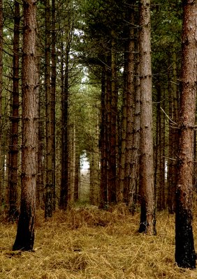
 This to me is evocative of a cathedral aisle. It makes me feel very small standing in such grandeur.
The Forestry Commission are at this very moment felling the pine trees in parts of the woods. It has made a huge difference and brought light where there was darkness. Light enough to encourage all the seeds so long ago shed of our native broadleaf trees. I am looking forward to watching them grow without any further help from man. So far they have not touched these giants.
This is my favourite of these entries and I am considering entering it in the BP comp. I may be stretching your ideas of a path. In truth it is simply the middle of a wider row of trees than the other rows. It would easily be possible to walk down it but there is a well used path as an alternative. It is not straw but dead ferns.
5 comments:
This is a beautiful and evocative shot, Kate.
It reminds me of a similar spot in B'ville that I call "The Spiral Grove." (After the feminine aspect of God.)
I am trying desperately to get ready to leave, so I don't have time to do comment justice to it now, maybe tonoght or tomorrow!!!!
Val I did play with the exposure and contrast. It was actually much foggier than it looks here but I preferred the brighter colours. The black on the tree trunks is actually where there has been a fire. From here I can see the bark quite clearly so I don't know if there is a difference in our monitors.
I would be curious to see the foggier version of this. This one almost looks sunny. I can see the bac on the trees and wondered about that. Also wondered why it looked heaped up rathered than flattened as if there was a path. I like this--might also like the foggier one????
I will post the original one now.
Neither of you have mentioned it but since I posted it on here it has been annoying me that aisle is not central so I have cropped it a bit on the right to even it up a bit more and I will probably post that version to BP.
I sort of like it off center, less static. But nice either way.
Post a Comment