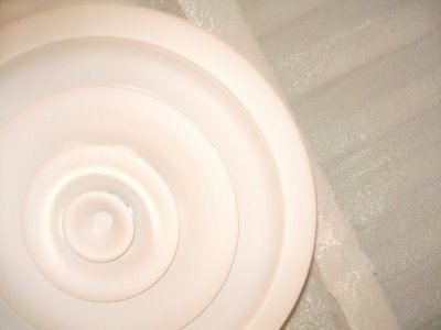
 Concentric and Parallel, by Mary Stebbins. Click image to view larger.
I loved the circles and lines, but ironically, this was painted a nice flat black and I took it as a low key image and my flash washed it out so bad it looks white! Aiee!

Consructive and helpful criticism for photos.
4 comments:
Oh what a shame I am sure it would be much better in black. I love the circles and lines too - very Rakesh - but it looks a bit flat!
It looked cool in black, much nicer, really! But I didn't have time to play and we were in a no photo zone and had already been hassled.
Yeah, the flash just washed it out.
Nice! Where you get this guestbook? I want the same script.. Awesome content. thankyou.
»
Post a Comment